


CRAZY 8’S: HATTER’S HAND
END TO END CASE STUDY
Role: Lead UX Designer
Skills Used: Information Architecture, User Flow, Market Research, Wireframing, Prototyping, Implementation
“Creating a casual card game experience that’s intuitive to learn, emotionally rewarding, and designed for repeat play.”
Market Research
I analyzed hyper-casual mobile games (Board Kings, Monopoly GO!, Coin Master) that leverage luck-based mechanics, progression loops, and social competition to drive engagement through simple, repeatable interactions. I felt that by integrating a lightweight card-matching mechanic (our initial idea) into a hyper-casual framework, we could deepen player engagement through intuitive interaction and perceived skill, without compromising simplicity.

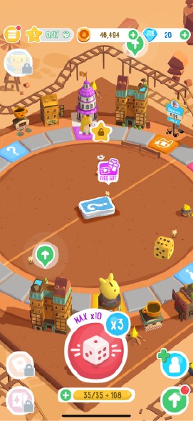
Monopoly Go

Coin Master
Board Kings
UX Goals

Intuitive Onboarding
I wanted to make sure that players were able to understand the core mechanics in the game within the first few minutes, whether by intuitive UI elements or through instructions.

Seamless Navigation
I wanted the UI to feel magical, yet functional. There should be minimal friction with how our player interacts with navigation.

Strategic Clarity
I want the choices and consequences that we present the player to empower their decisions.
Defining the Architecture
I mapped out an IA which was used to help both the engineering team and the design team focus on what happens on which screen / overlay. This IA also helped our team keep track of what features we still needed to work on for initial launch.

User Flow
Additionally, I also had to plan out the user flow for the three main core mechanics that we wanted our players to go through, the core gameplay loop, upgrading progression and purchasing IAPs.

Design Decision - Spatial Clustering
In order to guide player attention and reinforce intuitive task separation, I clustered similar task with each other with the initial design. On the left side of the screen, all the task pertaining to purchases (store, promos) were together. On the right side of the screen, task pertaining to progression (events, quest, upgrading) were clustered together. The centre of the screen was left for the main gameplay, as I did not want things that didn’t affect the moment to moment aspect of card playing to interfere with the player’s attention.

Initial Design
Design Decision - Mini-Game Timing
In the games that we researched initially, the mini-games would pop up after the player had interacted with the “Start” button and the player’s avatar had moved. For our game however, we felt that by forcing the player to enter the mini-games after playing their cards would be too sudden. Furthermore in order to reinforce to the player that there is a mini-game upcoming, we would have to create custom UI that would create more visual clutter on the screen. Therefore instead of having mini-games show up after playing cards, we would have the mini-games show up after the player hits the “Start” button, which in our case would be the “Deal” button. This interaction would also be consistent with the Joker select overlay that would pop up after the player hits Deal.

Player interacts with the Deal button.

Cards are dealt to the player. An extra mini-game card is also dealt.

Player receives an animation that loads them into the mini-game.
Initial Prototype
With the user flows and majority of the wireframes for the game completed, I was then tasked to collaborate with the art team to create a UI that aligned with the game’s visual identity while adhering to core UX principles; ensuring consistency, usability, and legibility across screens, and supporting gameplay clarity through intuitive visual hierarchy and interaction patterns.
Once we had a rough UI design ready, I was then focused on creating the individual views, overlays and templates (buttons, text, headers) in Unity, before passing them off to the engineers for them to code functionality.

Initial Wireframes

Initial Prototype
Iteration
During internal playtest, one of the reoccuring issues that came up was the lack of understanding to what the combo button did. In order to combat this, I redesigned the deal button cluster, splitting up the combo button into individual toggles, while also introducing a mini banner that appears whenever the player changes their combo.

Initial Design

Updated Design
Another usability issue that was also reoccuring was that our players were having trouble identifying which cards were being affected by their jokers, and also what the joker itself was. For this issue, I included an area on the joker and the cards which displayed an identifiable icon when joker effects were active on the card.

Initial Design

Updated Design
Launching
The final phase of work required close collaboration with the art team to ensure assets, screens, overlays along with any interactive elements received a high level of polish. Implementation of any additional animations and functionalities was also completed during this phase with support from the engineering team.

Main Gameplay

Quest Screen

Store Screen

Collection Screen

Royal Power Overlay
Impact
Crazy 8’s: Hatter’s Hand is currently undergoing open beta release in tier 2 and 3 countries (countries out of North America). The early results on retention are extremely encouraging and promising. Based on our retention numbers from previous games we had released as a studio, we predicted our day one retention to be around 35% and our day seven retention to be around 8%. However, our actually day one retention was 47% and our day seven retention was 12%.
