
RUPAUL’S DRAG RACE SUPERSTAR
SEASON PASS CASE STUDY
Role: Lead UX Designer
Skills Used: Management, User Research, Market Research, Wireframing, Prototyping, Implementation, AB Testing, Live Ops
RuPaul’s Drag Race Superstar is an award winning mobile game developed in 2020. The game features the contestants and stars of Hit Show RuPaul’s Drag Race. The game primarily features a Challenge gameplay, where player’s can battle against the AI in fashion challenges, and an Idle component where players can upgrade their workstations in order to earn more “Werk”. Live Ops in the game is still ongoing.
Challenge
Players lacked a long-term, month-to-month goal that would motivate sustained engagement.
Player behavior during Live Ops showed strong daily engagement with challenge gameplay, yet the reward system failed to deliver personalized or exclusive incentives. This gap presented an opportunity to introduce long-term goals and distinctive rewards that better aligned with player investment.
Business Goals

Increase Player Retention
Identifying ways to keep players engaged over time.

Discover New Revenue Streams
Discovering effective and player-friendly ways to increase in-game spending.
Market Research
To address a lack of long-term player motivation, I conducted market research of top mobile titles and identified Season Pass systems as a proven solution for sustained engagement.

Archero

Clash Royale

Candy Crush
Games like Archero, Candy Crush, and Clash Royale use Season Passes to deliver time-limited cosmetic and utility-based rewards. These features reinforce progression, create urgency, and consistently drive retention and monetization. Premium content is typically offered through monthly paid tiers, which aligns with our reward strategy and player expectations.
Opportunities
Season Passes offer players a clear progression path and exclusive rewards that encourage daily play. For games on the market, they generate steady monthly revenue by leveraging time-limited content to drive purchases. This gave us two opportunites that matched our business goals:
Enhance player retention by introducing meaningful, time-bound goals.
Drive monetization through a recurring revenue model tied to player engagement.
Key Questions behind our Design Process
To ensure the proposal was both player-centric and aligned with business goals, I grounded my design process with four key questions:
How could we design a Season Pass that is both engaging and valuable to our players?
How could we make each Season Pass unique and enticing to players?
How could we use this feature to support our current game economy?
Does it make financial sense to implement this feature, including ongoing Live Ops support?
Mapping the User Flow
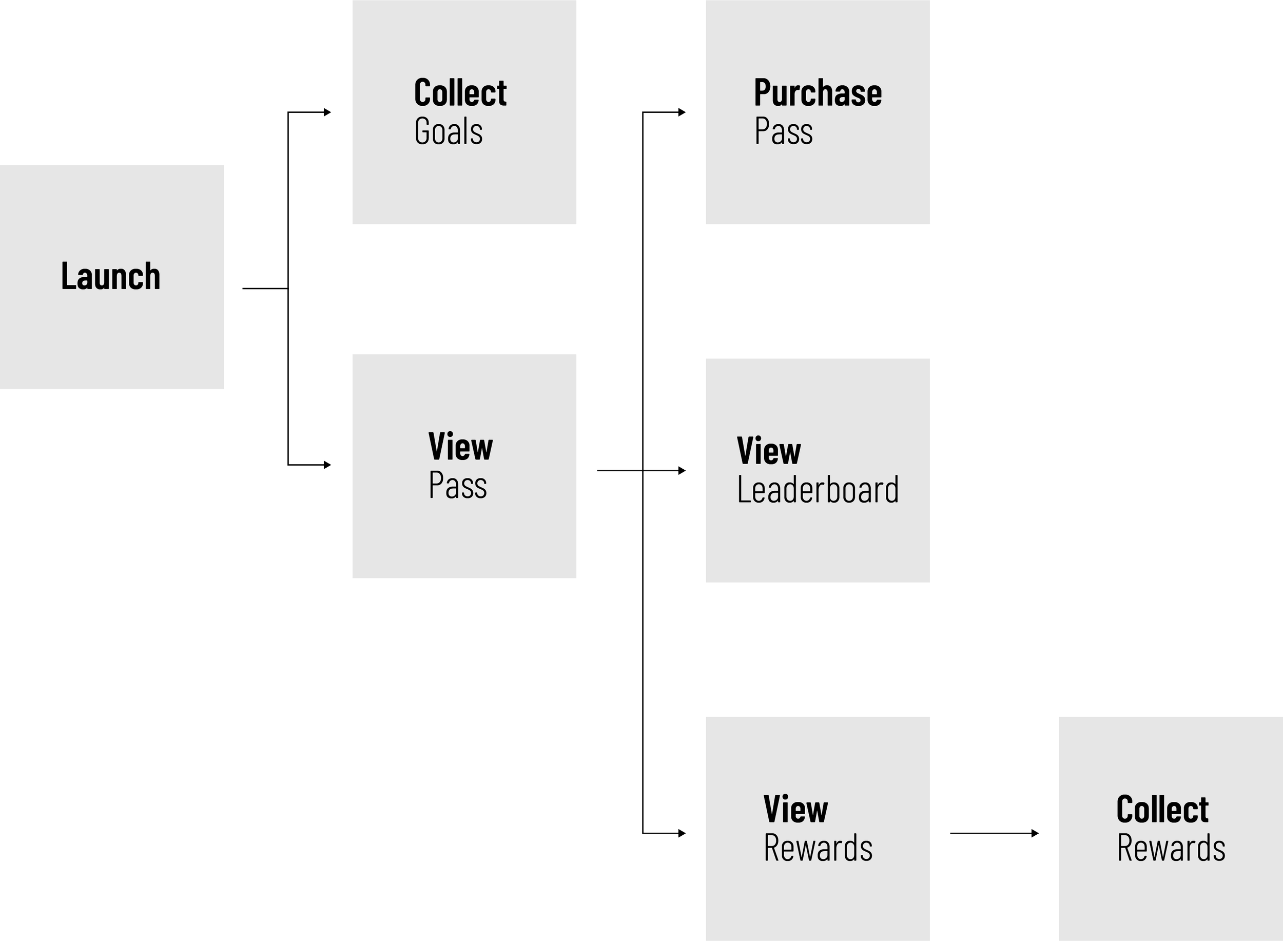
Designing to Drive Play
The initial design leveraged the real estate on the home screen to maximize visibility. By prioritizing progression inventives in this space, I theorized that it would create a clear and compelling path for our player to interact and engage with the season pass.
Existing Home Screen

Initial Wireframes

Initial Prototype
FOMO by Design
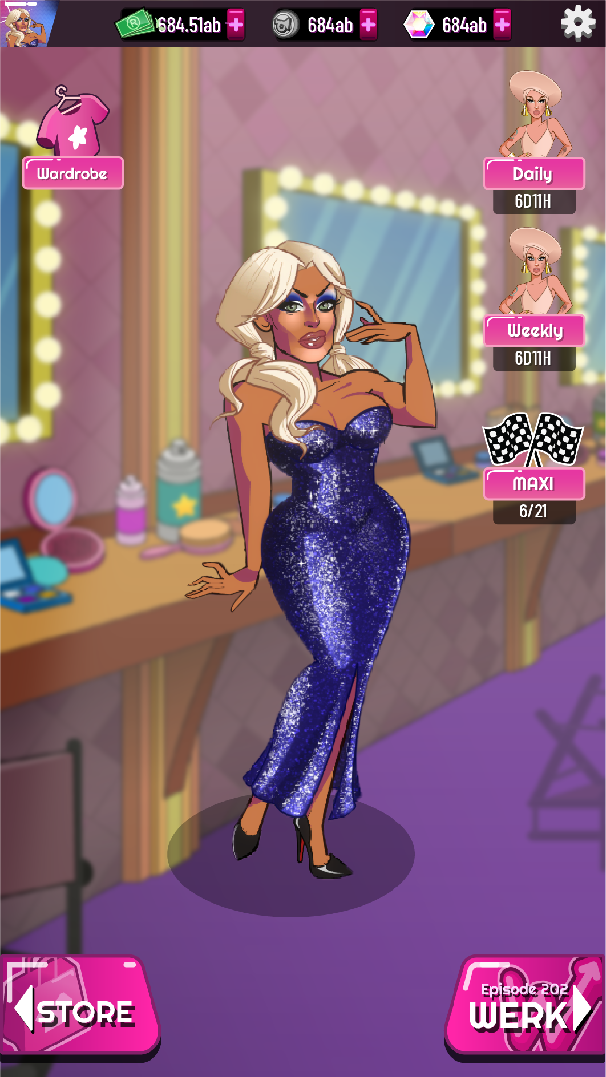
I designed the reward track to display both free and premium tiers side by side, making the value of the season pass immediately clear. This approach highlighted what players could earn, creating a sense of FOMO that encouraged deeper engagement and conversion.

Initial Wireframes

Initial Prototype
External Challenge
Our external stakeholders at this point of the design felt that we should not offer the player a free track, instead we should focus our design on creating a premium only feature. I flagged this as a UX risk as during our market research of other games, we found that by offering a free track, it would increase visibility of the feature as a whole.
Hypothesis
If the free track effectively draws players into the season pass screen, then increased exposure will result in higher conversion rates and monetization.
A/B Testing
To validate this theory, we ran an A/B test using Playtest Cloud. We tested a version with only a paid track against one with both free and paid tiers. The goal was to measure engagement, conversion, and overall player sentiment.


Variant A
This variant contained a free track.


Variant B
This variant did not contain a free track.
Player data confirmed that offering a free reward track increased season pass screen visits and purchase likelihood, validating the hypothesis that visible, accessible rewards drive engagement and support monetization.
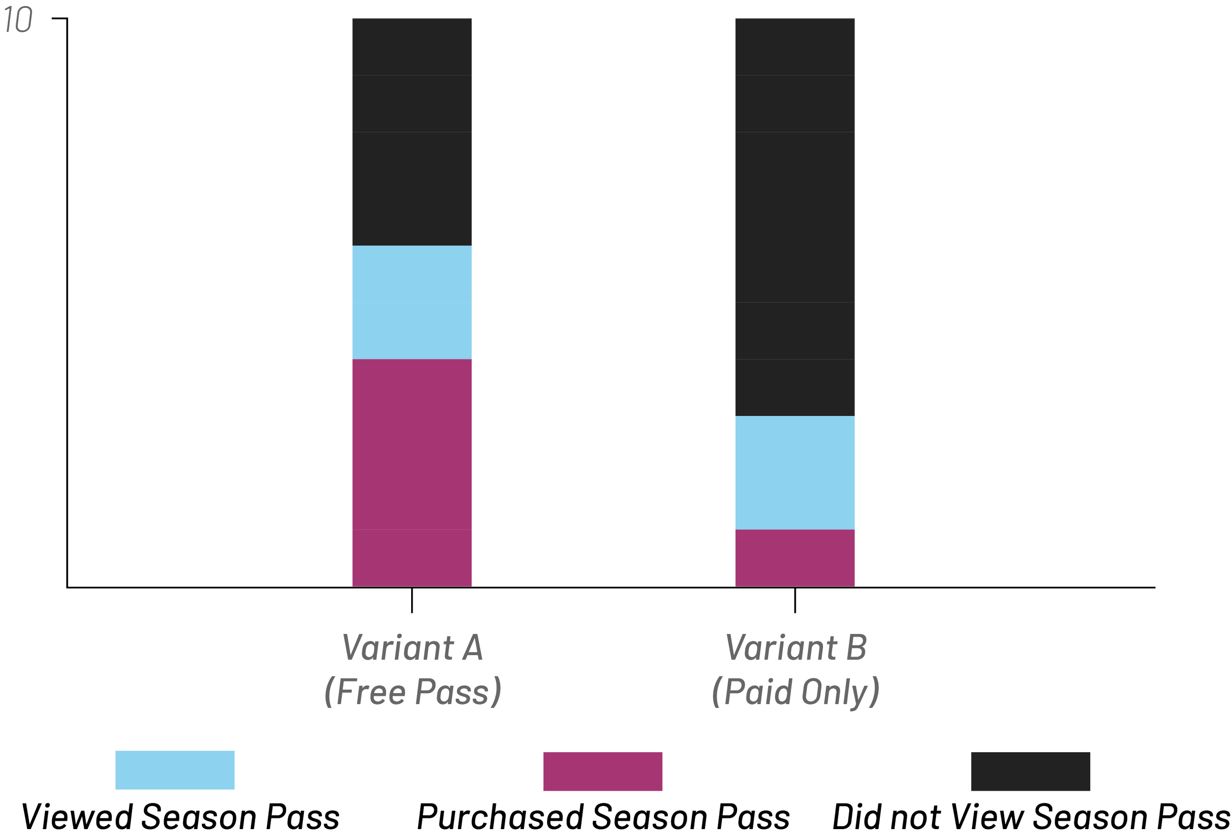
However, data was showing that although players were interacting with the season pass, they were not visiting the season pass screen.
Revision
The lack of clarity around the season pass entry point led to low player interaction and missed engagement opportunities, highlighting the need for more intuitive UI placement and clearer onboarding cues.

Initial Design

Revised Design
I redesigned the season pass entry point by replacing a vague banner with a clear, interactive button featuring embedded progress.
I also took a look at the season pass screen, increasing the size of buttons in order to meet mobile standards.

Initial Design
Revised Design
Impact
The Season Pass became a top-performing feature, generating $4–5 million in revenue, driving daily engagement, and fulfilling core business goals by adding a compelling progression loop, 40% of purchasers complete the season, and 85% reach the halfway mark.
